MANUSCRIPT
Ian N. Gregory
A Place in the Digital Humanities: Using GIS to better understand humanities geographies
Abstract
The use of Geographical Information Systems (GIS) has become well established in historical research, especially in the more quantitative parts of the discipline. This work has had a number of successes in demonstrating the importance of geography in historical analyses. More recently there have been calls for GIS to be used across the humanities. If this is to happen approaches to GIS need to be developed that allow it to be used with texts, the type of source most widely used in the humanities. This paper will review how GIS has been used in historical research to date and demonstrate how it can be applied to new disciplines such as Literary Studies.
I. Introduction
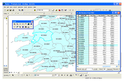
Figure 1: An example of a polygon-based GIS showing religious data from the 1841 census of Ireland.The attribute data table is shown on the right, the spatial data on the left.
In recent years the name digital humanities has increasingly become used as an umbrella term for the use of Information Technology (IT) across the range of humanities disciplines including history, literary studies, linguistics, classics, and archaeology.[1] In general digital humanities research involves work at three levels. First there is the development of databases concerned with relevant documents or artefacts. This involves capturing, structuring, and documenting the data to produce the database, and also longer term issues such as disseminating and preserving the data, the implications of which are often overlooked or under-estimated. Secondly, there is the development of generic methodologies to provide new insights into humanities datasets. This is the aim of fields such as corpus linguistics, the study of language found in real-world texts known as corpora.[2] Finally, there is the use of these datasets and techniques to increase our understanding of the humanities. This is the most important aspect of digital humanities as it raises the profile of the field from a relatively narrow technical specialism to something that has implications for the discipline or disciplines as a whole. Despite this, it is often the area of digital humanities that is most overlooked.
Geographical Information Systems (GIS) is a field of IT developed in the Earth Sciences and defence industries. At its core a GIS is a type of database which takes a conventional database table holding what are referred to as attribute data and links each row of data to a location on a map, called the spatial data. Spatial data can take the form of points, lines, or polygons (which represent areas or zones) if discrete features are to be represented. If a continuous surface is being modelled this is split into pixels. Figure 1 shows an example of a GIS of religious data from the 1841 Irish census. The attribute data table, shown on the right, contains the ID numbers of the administrative units used by the census along with data on the total population of each unit, the number of adherents to the established church - the Church of Ireland, the number of Catholics, and so on. The spatial data are the polygons representing these administrative units. These are on the left where the area to the south-west of Ireland is shown. Crucially the GIS knows that the highlighted row of attribute data refers to the highlighted polygon, so in addition to being able to answer thematic questions about what is happening, the GIS also able to answer questions about where this is happening.
While this architecture may seem fairly crude, it has had a major impact on the discipline of geography where the field of Geographical Information Science (GISc) has become increasingly influential.[3] Although GISc emerged in quantitative and data rich disciplines such as the Earth Sciences, it has spread through disciplines such as human geography and become increasingly important in history where Historical GIS is now an established field. As space is at the core of the way a GIS models the world this has led to a significant re-awakening in interest in geographical aspects of historical research although.[4] GIS has also been extensively used in archaeology where its ability to map survey's has been invaluable.[5] There is a growing interest in how GIS can be applied to other disciplines within the humanities such as Literary Studies or linguistics where either there is an interest in geography but this has been limited by its ability to handle the complexity of geographical information without a GIS, or geographical aspects of the research have to date been overlooked.
This paper will review how GIS has made an impact to date on quantitative history before exploring how it can be used within text-based disciplines such as literary studies and linguistics.
II. GIS and quantitative history
The use of GIS has gained considerable acceptance within the discipline of history.[6] One of the earliest manifestations of Historical GIS was the development of national historical GIS databases. These originated because it was realised that census data were highly suited to GIS because they consist of tables of statistical data that refer to precisely defined administrative units. National historical GISs thus set out to capture the changing boundaries of historical administrative units and link them to census and similar statistics over time. A variety of different approaches to doing this were developed[7] and a wide range of countries including Britain,[8] the United States,[9] Belgium,[10] Holland,[11] and Germany[12] have build or are building systems of this type. The progress and issues that the potential that the Great British Historical GIS (GBHGIS) faced illustrates both the potential and the difficulties faced by building these systems and more generally in using GIS to advance historical scholarship.
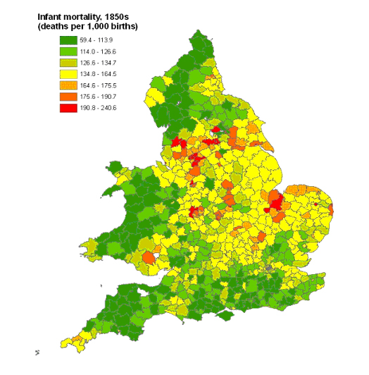
Figure 2: Infant mortality in England and Wales, in the 1850s.
The GBHGIS took around six years to build and cost over £500,000, mainly from the Economic and Social Research Council (ESRC). Building it involved developing an architecture that could store changing administrative boundaries in a way that would allow a user to specify a date and type of unit. The system would extract the boundaries specified and then be able to link them to attribute data such as census tables using place names. The main technical challenges in doing this were quickly overcome,[14] the time and money were soaked up in researching how historical administrative boundaries changed over time and capturing these from map sources. The construction of the attribute database, which required scanning and using Optical Character Recognition (OCR) technology to digitise a large number of census, vital registration, and similar statistics was also a significant undertaking. Once it was complete the system held most recurrent census and vital registration data from the early nineteenth century, when statistics in this form first became available, to the 1970s. Later data were already in GIS form so were not re-captured.
Even after having spent all of this time and money all that had really been created was a database, albeit a large and sophisticated one. The system maked producing maps like the one shown in Figure 2 relatively trivial. This takes data on infant mortality, deaths among babies before their first birthday, published in the Registrar General's Decennial Supplement of 1861 covering the 1850s, links it to the boundaries of registration districts in 1861, the units used by the infant mortality tables, and produces a map such as the one shown. The whole process can be done in a few minutes. The pattern that the map shows suggests that high rates of infant mortality, shown in red, were particularly prevalent in the urbanising and industrialising parts of England and Wales. There were also exceptions to this such as the Fens, a very rural area in the east of England south of the Wash. The lowest rates, shown in green, are found in southern England, much of Wales, and northern England. While being able to produce maps like this and describe the patterns that they show is useful, it will not of itself justify the investment that went into creating the system.
Two different strategies were followed to develop the system further. On the one hand Dr H. Southall, who directed the original project, secured a further large grant to make the database accessible and interesting to a wide audience of "life-long learners." This was funded through money from the National Lottery rather than an academic source with a grant that was larger than the original funding that created the system. The project produced the Vision of Britain through Time website[15] that aimed to provide data on individual localities in a comprehensible manner. Although some additional content was added, the major challenge was to disseminate complex GIS data with a large temporal component to a broad audience in a user friendly way.[16] The website was launched in 2006, attracting significant attention from the national media including the BBC. It now typically attracts over 50,000 unique users per month, has been included in lists of best websites by at least two national newspapers, and was described by Ancestor Magazine in September 2006 as "By far the most comprehensive source of local history in England, Wales and Scotland."[17] This system has thus been highly successful in providing historical geographical information to a wide audience. However this dissemination exercise cost at least as much as building the original database in the first place, and while it has been highly successful in providing information to the general public, the system does not make any direct contribution to knowledge within academic history.
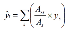
A key point about the GBHGIS is that it holds data about that are located in both space and time so it should be able to provide information about how different parts of the country have changed in different ways over time. This in turn should provide new insights into long-term historical change. The difficulty in doing this is the problem of boundary changes which mean that it is usually not possible to compare one census with the next, let alone compare a long time series of data. A series of GIS-based techniques called areal interpolation allow data from different administrative units to be standardised onto a single set of administrative boundaries known as target units. A simple approach to doing this is to assume that data are evenly distributed across their areas and allocate data to the target zones using the formula:
(1)
where ŷt is the estimated value for the target zone, ys is the value for the source zone, As is the area of the source zone, and Ast is the area of the zone of intersection between the source and target zones.[18]
There are two problems with this: first the assumption of an even population distribution across administrative units is clearly unrealistic, and secondly the results of any interpolation will be estimates that will inevitably contain some error and some measure of how much error is in individual data values is required. The first one of these problems was handled by the development of more sophisticated areal interpolation techniques that used the EM algorithm to allow data from the target units to help estimate how data were allocated across the source units. This was shown to greatly enhance the accuracy of the interpolation.[19] Using this allowed data from a wide number of dates to be interpolated onto a single set of target units for direct comparisons. The second problem could be solved by searching each target districts' time-series for sudden changes in values that occurred at the same time as a boundary change. Significance tests could then be devised to see if these changes were unlikely to have occurred randomly. This provided information on which individual data values were likely to contain interpolation error and, importantly, which could be considered reliable.[20]
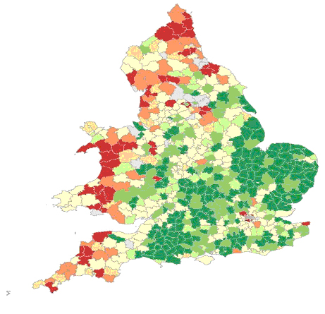
Figure 3: Deaths averted by infant mortality decline, 1860s-1900s. Green areas showed the largest proportion of infant deaths averted, areas in red show the smallest.[22]
Again developing these methodologies took time and money and contributed little if anything to historical scholarship beyond the narrow field of spatial analysis within Historical GIS. However these developments opened up the potential for new analyses that genuinely do contribute to the discipline of history. An example of this is as follows. In Victorian England & Wales people were flooding into towns and cities as a result of the Industrial and Agricultural Revolutions. This caused enormous problems within the cities as the infrastructures could not cope leading to problems of overcrowded housing and poor sanitation. This in turn led to serious health problems which particularly manifested themselves in appallingly high rates of infant mortality which could reach rates of over 200 deaths per 1,000 births in some places. The Victorians were aware of these problems and took measures first to collected statistics on the problem, starting in the 1840s, and then took direct action through public health legislation and local government reform in the 1870s, '80s and '90s. Infant mortality rates then started to decline dramatically, a decline that has continued throughout the twentieth century. The key point about this is that urban areas were seen as the problem, and government intervention and public health reform as the major cause of infant mortality decline.[21]
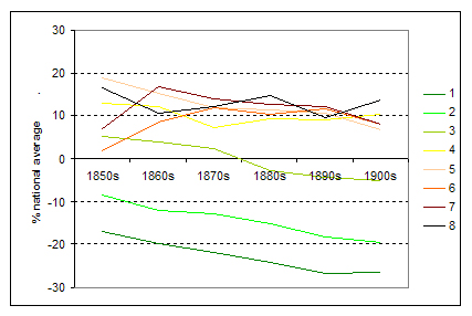
Figure 4: Infant mortality decline by urban level, 1850s-1900s. Level 1 areas are the most rural, level 8 the most urban.[23]
To investigate this infant mortality data from the 1850s to the 1900s were interpolated onto a single set of administrative units to allow a consistent analysis to be performed over time. One thing that this allowed was to ask the counterfactual question of how many infant deaths would there have been had infant mortality rates remained at their 1850s level and, from this, how many deaths had been averted by the fact that decline occurred. Figure 3 maps these results. The areas shaded in dark green contain the 10% of the population that had the largest number of averted deaths, the lighter green holds the next decile, and the palest green the third decile. The three deciles with the smallest number of deaths averted are shown in red with the darkest having the smallest number. These are the areas where infant mortality decline had the least impact. The four deciles in the middle are shaded pale yellow. This pattern is highly surprising and contrasts with the orthodox story of when and how infant mortality declined. Areas in the rural south and east showed the highest declines whiles areas in the rural north and west saw the smallest. Urban areas were fairly average.
Figure 4 shows the pattern of infant mortality decline by different types of areas using their population density to measure how rural or urban they are. In all cases the data are compared to the national infant mortality rate. Again there is a clear pattern. Urban areas broadly followed the national rate while being around 10% above it. Rural areas, however, were declining at least by the 1860s and possibly before that.
The significance of these results is that as infant mortality decline had started in rural areas before public health legislation was introduced and was most pronounce in these areas then there must have been an alternative reason as to why infant mortality decline started. It seems likely that whatever this process was it did have a major impact in urban areas because of the well documented problems in these areas. The reasons it did not take hold in rural parts of the north and west are less clear.[24]
This shows both the advantages and limitations of using GIS in historical research. By having a comprehensive database and taking an approach that asks "how do different places behave differently from each other and from the national aggregate?" it is able to challenge the existing orthodoxy that infant mortality decline was led by public health solutions. It is not that these solutions did not have an impact, but they cannot have been the major factor in causing infant mortality decline as this was already well established in some areas before these reforms were introduced. The limitation is that, this type of analysis is unable to effectively explain why infant mortality did decline although it could provide context to detailed local case studies by saying what areas showed similar patterns and which did not. In short, therefore, while the GIS is a highly effective descriptive technology and can thus challenge existing orthodoxies, it cannot present its own explanations. This means that GIS has to complement good historical scholarship that considers the importance of geography, it cannot replace it.
A number of other researchers in different fields of history have also used GIS to help them understand the geography, of the patterns that they study. These have been conducted at national, regional, and city scales. In environmental history G. Cunfer explores the Dust Bowl that occurred in the Great Plains of 1930s America.[25] He states that the orthodox explanation of the Dust Bowl is that inappropriate agriculture fuelled by the pressures of capitalism led to areas of the Great Plains being ploughed that were only suitable for grazing. This led to the destruction of the topsoil which then became highly vulnerable to literally blowing away in storms. This orthodoxy, Cunfer argues, originated with New Deal officials in the 1930s and became established in a 1980 study of two counties in the centre of the Dust Bowl area, Haskell County, Kansas and Cimarron County, Oklahoma. By using GIS and studying the entire Great Plains region over a long period of time Cunfer is able to show that Dust Storms occurred in many places that were not ploughed. He is also able to show that there seemed to be a strong relationship between the high temperatures and low rainfall in the centre of the Great Plains in the mid-1930s. His argument is thus that the Dust Storms were caused by drought rather than insensitive agriculture. He argues that the orthodoxy was wrong because it only studied a small number of areas and applied its conclusions widely. By covering a larger area, albeit in less depth, he is able mount a highly effective challenge to this orthodoxy, and also to develop his own explanation.
Other examples of the effective use of GIS include A.K. Knowles and R.G. Healey's study of the Pennsylvanian iron industry in the antebellum period,[26] B.M.S. Campbell and K. Bartley's study of land-use in medieval England,[27] W.G. Thomas and E.L. Ayre's study of slavery in the US prior to the Civil War,[28] A.W. Pearson and P. Collier's study of patterns of agriculture in nineteenth century Wales,[29] and studies of urban areas and their problems such as C. Gordon's study of St. Louis,[30] A.E. Hillier's study of mortgage redlining in Philadelphia,[31] and E. Diamond and D. Bodenhamer's study of white-flight in Indianapolis.[32] It is clear from this work that Historical GIS is making a significant contribution to knowledge in a wide range of areas within the discipline of history. It is also clear, however, that much of this work is based on quantitative and cartographic sources. This inevitably limits its applicability in history and even more so to other disciplines in the humanities. If GIS is truly to become a tool across the humanities then it needs to become one that works effectively data in textual form.
III. Applying GIS to Literary Studies
If GIS is to be used in text-based disciplines such as Literary Studies then two questions need to be answered: first, can GIS make a contribution to knowledge within these disciplines, and second, can the technology be adapted to make this contribution. The next two sections of this essay will attempt to begin to answer these however as this is field is in its much earlier stages than it is in quantitative history the answer is not as clear cut as it is in the previous section.
There is clearly an interest in geography in fields such as Literary Studies. P. Brooker and A. Thacker claim "One of the most innovative tendencies in contemporary literary and cultural studies is the investigation of space and geography."[33] Books such as F. Moretti's Atlas of the European Novel 1800-1900[34] and M. Bradbury's The Atlas of Literature[35] would seem to back this assertion up. Moretti argues that Literary Studies needs to stand back from the detailed study of individual texts and instead take a more general and abstract approach that he terms distant reading. He particularly argues that three vehicles can be used to implement this approach: graphs, to look for example about how particular genres developed and the faded over time; trees to look at how the evolution of particular genres or styles took place; and maps to explore the geographies within novels.[36] While graphs and trees are effective ways of implementing distant reading, mapping is not. The difficulty is that mapping a text requires a great deal of detailed reading to extract place names and locations. This is very time consuming and laborious work. A second problem with mapping as performed by Moretti and, to my knowledge, all others working in the field, is that it is based on traditional forms of paper mapping rather than the more powerful options provided by GIS.
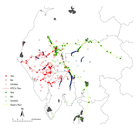
Figure 5: A basic GIS of the journeys of Gray and Coleridge. Yes, No, and Unclear refer to whether the author actually visited the place (yes), or simply mentions it in his account. Numbers refer to where each writer started the day thus Gray started the 1st day of his tour at Brough on the eastern side of the map.
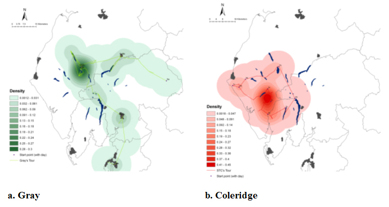
Figure 6: Density smoothed maps of places visited by Gray and Coleridge.
It therefore seems clear that there is the potential to use GIS in Literary Studies but what would a literary GIS look like and how could it advance the discipline? To attempt to answer this a pilot project was conducted exploring the potential of the literary GIS of the English Lake District. The Lake District is a relatively small mountainous area in the north-west of England. It covers around 880 square miles that contains England's highest mountain, Scafell Pike (977m.), and a number of large lakes, the biggest of which, Windermere, is 10.5 miles long. The area has long been famous for its natural beauty reflected in a strong literary and artistic tradition of which the poems of William Wordsworth are perhaps the best known example. The aim of the pilot project was to take two early accounts of tours of the Lake District and convert them into a GIS. The first account was written by Thomas Grey in 1769, an account that is famous for its contribution to the Picturesque movement. The second was written by Samuel Taylor Coleridge in 1802 and marked a rejection of the Picturesque and a movement to the Romantic. Itincludes the first recorded ascent of Scafell.
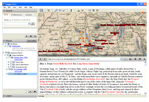
Figure 7: The Lake District Literary GIS in Google Earth. The illustration shows part of day one of Coleridge's tour. Place names are highlighted in red.[37]
The project typed up the two accounts and during this process the place names were marked up using XML (eXtensible Markup Language) so that they could subsequently be extracted. This list of place names was then converted into a point layer using a place name gazetteer that gives a grid reference for each place. Some work to deal with spelling variations was required at this stage. Once coordinates had been added it was a relatively trivial task to convert the resulting data into a GIS point layer and also to create lines representing the approximate journeys taken. These are shown in figure 5 which show the places visited by the two authors, places that they named but did not visit, and straight lines to give the approximate journeys that the two writers took. One problem with this type of mapping is that dot maps do not present a very clear idea of pattern. Figure 6 uses a technique called density smoothing to emphasise the places that the authors are, and are not, talking about. It is clear from this that Gray follows a route that is highly concentrated on the urban centres and valleys of the Lake District. In particular, he spends a lot of time talking about the area around Keswick in the north-west of the region as well as Penrith, Kendal and Lancaster. Coleridge, by contrast, spends much of his time in the more remote part of the Lake District, in particular the area around Scafell. Something that emerges strongly from this pattern is that even though the two authors were talking about the same place, the Lake District, the places within this that they were talking about were actually quite different.
This example shows how GIS can be used to quickly produce static maps suitable for distant reading. Beyond this, Google Earth[38] increasingly allows us to place spatially referenced data on the internet in a way that is easy and intuitive to use. To take advantage of this we marked the two texts up as HTML with the place names highlighted in red. These were place on a website beneath a Google Earth representation of the Lake District that included representations of these places. An 1815 map of the Lake District was also included for reference purposes. The structure is shown in figure 7. This allows the reader (or user) to read the text in the bottom window while exploring the places that they refer to in the top.[39] The example shows the beginning Coleridge's tour as he leaves his house in Greta Hall, Keswick and heads south-west towards Ennerdale. One thing that emerges is the incredible richness of place names in Coleridge's prose. Even with detailed local knowledge these are hard to follow, without this knowledge they are all but meaningless, however having the map immediately available allows us to contextualise the places referred to and gain a much richer understanding of the text.
IV. Creating a GIS from a text
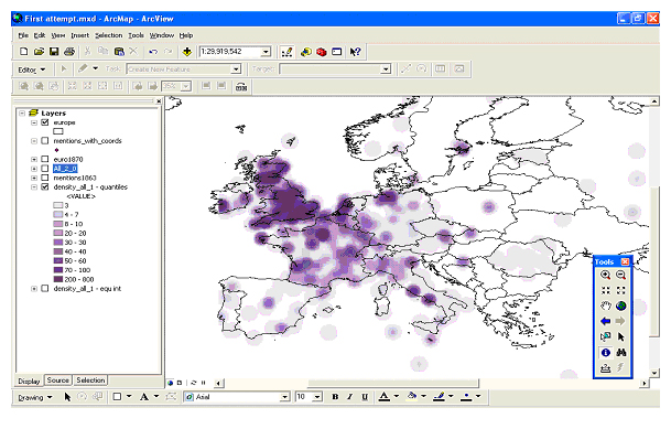
Figure 8: The Lancaster Newsbook Corpus as a GIS.
The two approaches described above show the potential for using GIS to do distant reading, or detailed reading. The problem remains that the pilot project deliberately chose two short texts, both were around 10,000 words long, and extracted the place names from it manually. If we are to implement this properly to allow distant reading of the spatial patterns within large volumes of text then there is a need to develop techniques that allow the automated extraction of place names from large volumes of text. This can be achieved using techniques developed within the field of corpus linguistics. Place names are proper nouns and techniques to allow these to be extracted from a text are well established. Once all of the proper nouns have been identified they can be filtered to remove instance such as "the Duke of York" by excluding all place names with the phrase "duke of..." before them. Once a list of possible place names has been created this can then be matched against a place name gazetteer to add co-ordinates to them. Words that do not match the gazetteer can then be checked to see if they are variant spellings, places that do not occur in the gazetteer, or are proper nouns that are not place names.
To test this technology the Lancaster Newsbooks Corpus[40] was used. This is a corpus of around 800,000 words taken from newsbooks published in London in the mid-1650s. Figure 8 shows the results of extracting the place names from this and using density smoothing on them in a GIS. Clear spatial patterns are obvious from this map. Clearly London-based newsbooks paid most attention to England but places such as Scotland and the Low Countries also attracted many mentions. There are also some distinct clusters around capital cities such as Paris and Madrid and many coastal cities, including Rome, Naples, Brest, Amsterdam and Hamburg are also prevalent. The reason that ports tend to stand out is that many stories were brought back to London from overseas and would have the place that they passed through included within the text.
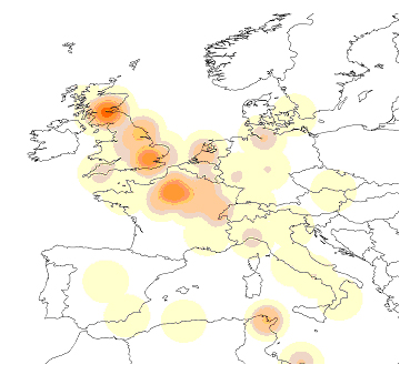
Figure 9: Mentions of money in the Lancaster Newsbooks Corpus.
This demonstrates that we can convert large bodies of text into a GIS in a fairly straight-forward manner. However there is a further issue that also needs to be resolved as a researcher is likely not only to want to know where a body of text is talking about but also what it is saying about those places. Again corpus linguistics can help using techniques called semantic tagging and concordance.[41] Semantic tagging basically classes every word in a corpus according to its meaning while concordance allows us to extract every word that occurs within a certain number of words from another word to be extracted. By combining them we can extract every place name from a text and then see what words occur within five words of this. These can then be classed according to what subject they are talking about, so all places that are within five words of a word associated with themes such as finance, governance, or was can be mapped.
Figure 9 maps mentions related to money or wealth from the Newsbooks Corpus. There were 140 mentions of these terms within five words of a place name. A very clear pattern emerges with clusters centred on London, Edinburgh and Paris. Smaller clusters are found centred on Tunis, Amsterdam, and Scarborough. Of these the Tunis cluster is, in fact, somewhat misleading as there are several calls within the corpus to "bring the Turks to account in Tunis," the word "account" being tagged erroneously in this case. The Scarborough cluster however is genuine. England was at war with Holland at this time and there are a number of stories of landing captured Dutch vessels in Scarborough to claim prize money.
These maps illustrate that it is possible to extract place names from text and use this to produce maps of which places a text is talking about and what it is saying about those places. In this way it becomes possible to take large volumes of text and start to implement the idea of distant reading using them.
V. Conclusions
In little over a decade GIS has made remarkable progress within humanities research. This has been most pronounced in the more quantitative approaches to history where researchers using GIS have made significant contributions to knowledge in fields as diverse as historical demography, medieval history, environmental history and urban studies. GIS is also starting to make progress in other disciplines of the humanities where there is already an understanding that geography is important but where to date the understanding of it has been limited by the available technology. In Literary Studies there is a tradition of interest in geography but this has been restricted by the difficulties of producing maps of text. In linguistics the importance of geography has been largely overlooked. It is clear from the above work that it is technically possible to convert a large corpora into GIS form and that once done there is the potential to make a significant contribution to knowledge using it. The challenge from here is to take this further and actually implement these approaches in a way that makes a clear contribution to knowledge.
Acknowledgments:
Much of the work that described in sections III and IV of this paper have been conducted at Lancaster University as part of their initiative in Digital Humanities. The work on the Lake District was funded by the British Academy under grant SG46005 "Literary mapping of the Lakes: A pilot for a humanities GIS." Thanks to Drs. David Cooper and Sally Bushell (both from the Department of English & Creative Writing) for their help on this work. Thanks also are due to Dr. Andrew Hardie (Department of Linguistics) for his work on the Lancaster Newsbooks Corpus.
- [1]
- See the essays in Schreibman S., Siemens R. and Unsworth J. (eds.) A companion to Digital Humanities, 2004, Oxford, UK: Blackwell for a recent review of the field.
- [2]
- McEnery A.M. and Wilson A. Corpus Linguistics, 2nd edition, 2001, Edinburgh, UK: Edinburgh University Press.
- [3]
- Goodchild M. Geographical Information Science, International Journal of Geographical Information Systems, 1992, 6, pp. 31-45
- [4]
- See Gregory I.N. and Ell P.S. Historical GIS: Technologies, methodologies and scholarship, Cambridge, UK: Cambridge University Press or the essays in Knowles A.K. (ed.) Placing History: How maps, spatial data and GIS are changing historical scholarship, 2008, Redlands, CA, USA: ESRI Press
- [5]
- Wheatley D. and Gillings M. Spatial Technology and Archaeology: The archaeological applications of GIS, 2002, London, UK: Taylor & Francis
- [6]
- See: Baker A.R.H. Geography and History: Bridging the divide, 2003, Cambridge, UK: Cambridge University Press; Fleming R. and Lowerre A. MacDomesday Book, Past and Present, 2004, 184, pp. 209-232; Gregory I.N. and Healey R.G. Historical GIS: Structuring, mapping and analysing geographies of the past, Progress in Human Geography, 2007, 31, pp. 638-653
- [7]
- Gregory I.N. Time variant databases of changing historical administrative boundaries: a European comparison, Transactions in GIS, 2002, 6, pp. 161-178
- [8]
- Gregory I.N., Bennett C., Gilham V.L. and Southall H.R. The Great Britain Historical GIS: from maps to changing human geography, The Cartographic Journal, 2002, 39, pp. 37-49
- [9]
- Fitch C.A. and Ruggles S. Building the National Historical Geographic Information System, Historical Methods, 2003, 36, pp. 41-51
- [10]
- VanHaute E. The Belgium Historical GIS, Historical Geography, 2005, 33, pp. 136-139
- [11]
- Schreven L., Boonstra O. and Doorn P. Towards a Historical Geographical Information System for the Netherlands (HGIN), Historical Geography, 2005, 33, pp. 143-145.
- [12]
- Kunz A. and Boehler W. HGIS Germany: An information system on German states and territories from 1820 to 1914, Historical Geography, 2005, 33, pp. 145-147.
- [13]
- For a review see: Knowles A.K. (ed.) "Reports on National Historical GIS projects" Historical Geography, 2005, 33, pp. 293-314. Note that there is also a national historical GIS for China but this follows a very different approach, see Berman M.L. Boundaries or networks in historical GIS: Concepts of measuring space and administrative geography in Chinese history, Historical Geography, 2005, 33, pp. 118-133 or Bol P. and Ge J. China Historical GIS Historical Geography, 2005, 33, pp. 150-152.
- [14]
- Gregory I.N. and Southall H.R. Spatial frameworks for historical censuses - the Great Britain Historical GIS, in Hall P.K., McCaa R. and Thorvaldsen G. (eds.) Handbook of Historical Microdata for Population Research, 2000, pp. 319-333, Minneapolis, USA: Minnesota Population Center
- [15]
- See: http://www.visionofbritain.org.uk. Accessed 8th Jan 2009.
- [16]
- Southall H.R. A Vision of Britain through Time: Making sense of 200 years of census reports, Local Population Studies, 2006, 76, pp. 76-84
- [17]
- My thanks to Dr. Southall for bringing these facts and statistics to my attention.
- [18]
- Goodchild, M. F., and Lam, N. S.-N. Areal interpolation: A variant of the traditional spatial problem, Geo-Processing, 1980, 1, pp. 297-312.
- [19]
- See: Gregory I.N. The accuracy of areal interpolation techniques: Standardising 19th and 20th century census data to allow long-term comparisons, Computers Environment and Urban Systems, 2002, 26, pp. 293-314 and Gregory I.N. and Ell P.S. Breaking the boundaries: Integrating 200 years of the Census using GIS, Journal of the Royal Statistical Society, Series A, 2005, 168, pp. 419-437.
- [20]
- Gregory, I.N. and Ell P.S. Error sensitive historical GIS: Identifying areal interpolation errors in time series data, International Journal of Geographical Information Science, 2006, 20, pp. 135-152.
- [21]
- See: Woods R.I., Watterson P.A. and Woodward J.H. The causes of rapid infant mortality decline in England and Wales, 1861-1921. Population Studies: Part I, 1988, 42, pp. 343-366 and Part II, 1989, 43, pp. 113-132. See also: Woods R.I. Infant mortality in Britain: A survey of current knowledge on historical trends and variations, in Bideau A., Desjardins B., and Brignoli H.P. (eds.) Infant and Child Mortality in the Past, 1997, pp. 74-88, Oxford, UK: Clarendon Press
- [22]
- Source: Gregory I.N. Different places, different stories: Infant mortality decline in England and Wales, 1851-1911, Annals of the Association of American Geographers, 2008, 98, pp. 773-794
- [23]
- Source: Gregory I.N. Different places, different stories: Infant mortality decline in England and Wales, 1851-1911, Annals of the Association of American Geographers, 2008, 98, pp. 773-794
- [24]
- Gregory I.N. Different places, different stories: Infant mortality decline in England and Wales, 1851-1911, Annals of the Association of American Geographers, 2008, 98, pp. 773-794
- [25]
- Cunfer G. On the Great Plains: Agriculture and environment, 2005, College Station, TX, USA: Texas A&M University Press
- [26]
- Knowles A.K. and Healey R.G. Geography, timing, and technology: A GIS-based analysis of Pennsylvania's iron industry, 1825-1875, Journal of Economic History, 2006, 66, pp. 608-634
- [27]
- Campbell B.M.S. and Bartley K. England on the Eve of the Black Death: An atlas of lay lordship, land and wealth, 1300-49, 2006, Manchester: UK: Manchester University Press.
- [28]
- Thomas W.G. and Ayers E.L. An overview: The differences slavery made: A close analysis of two American communities, American Historical Review, 2003, 108, pp. 1298-1307
- [29]
- Pearson A.W. and Collier P. The integration and analysis of historical and environmental data using a Geographical Information System: Landownership and agricultural productivity in Pembrokeshire c. 1850" Agricultural History Review, 1998, 46, pp. 162-176
- [30]
- Gordon C. Mapping Decline: St. Louis and the fate of the American city, 2008, Philadelphia, USA: University of Pennsylvania Press
- [31]
- Hillier A.E. Spatial analysis of historical redlining: A methodological exploration, Journal of Housing Research, 2003, 14, pp. 137-167
- [32]
- Diamond E. and Bodenhamer D. Investigating white-flight in Indianapolis: A GIS approach, History and Computing, 2003, 13, pp. 25-44
- [33]
- Brooker P. and Thacker A. Geographies of Modernism: Literatures, cultures, spaces, 2005, Abingdon, UK: Routledge. Quote taken from the title page.
- [34]
- Moretti F. Atlas of the European Novel 1800-1900, 1999, London, UK: Verso
- [35]
- Bradbury M. (ed.) The Atlas of Literature, 1996, London, UK: De Agostini
- [36]
- Moretti F. Graphs, Maps, Trees, 2005, London, UK: Verso
- [37]
- On this website extracts from Coburn K. (ed.) The Notebooks of Samuel Taylor Coleridge. Volume 1, 1794-1804, 1957, London, UK: Routledge & Kegan Paul are reproduced by permission of the Taylor & Francis Group.
- [38]
- See http://earth.google.com (viewed 8th Jan. 2009)
- [39]
- This is available from: http://www.lancs.ac.uk/mappingthelakes (viewed 8th Jan. 2009)
- [40]
- This is available from the Oxford Text Archive: http://ota.ahds.ac.uk (viewed 8th Jan. 2009)
- [41]
- See: Wilson A. and Rayson P. Automatic content analysis of spoken discourse, in Souter C. and Atwell E. (eds.) Corpus Based Computational Linguistics, 1993, pp. 215-226, Amsterdam, Holland: Rodopi or Rayson P. Wmatrix: a web-based corpus processing environment, 2008, Lancaster, UK: Computing Department, Lancaster University available from: http://ucrel.lancs.ac.uk/wmatrix